New to Our Wedding Community? Browse our wedding planning guide to find the perfect photographer, invitations - you name it!
Two months ago, I created a custom wedding logo for a couple with a "sophisticated rustic" wedding theme - perfect for their location in the heartland of America. Nicole, the bride, was interested in finding the perfect rustic frame for the couple's initials, N and Z. She also wanted the initials to be symmetric - with the Z as a rotation of the N. She wanted a bit of a country feel, but still wanted some elegant, ornate sophistication.
These were the ideas I came up with:
I gave her five starting options with a variety of frames - some thick and floral, some thin and scripty. But I tried to get a bit of a natural feel into each one. I also tried to vary the font and placement of the couple's first initials so she could have a variety of choice on that front, too.
Nicole showed the logo to her friends and family. The consensus was that they liked the N and Z intertwined from option #2, but didn't love the frame, and preferred the border from #5 (which was also my favorite). So based on that input, I gave her some new ideas.
This time, I didn't change the frame at all, but I did try a few different ways of intertwining the initials, in a couple of different fonts. She liked design #3, but wanted a bit more space between the frame and the initials.

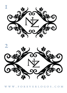
So in the next round of ideas, I gave her two options: in the first, I "opened" the frame up a little to create more space inside, without changing the initials. In the second, I made the initials smaller, and kept the frame as it was. I eagerly awaited her response.
She loved the first one, so all we had to do was find the perfect color for the logo, and create a second version with the wedding date! I gave her some different font options for the date, and tried to put the logo in her wedding color: eggplant.
The color wasn't quite right, but she did like the option on the bottom right. So I sent her this:

And it was perfect! Finally, her logo was just as it should be.
I am often asked how long it takes to design a custom wedding logo. The answer is that it depends almost entirely on the client. In this case, the design took under a week - Nicole was prompt and knew what she was looking for.
Often, I am also asked how many versions of a design I'll do for a custom wedding logo. The answer is that it is almost entirely unlimited. I have worked with couples through a month of designing, and in some cases I've worked with them through over ten rounds of designs. I know that how important it is that the wedding logo be just right to capture the spirit and theme of your wedding - and I'm willing to work with you to make it perfect!
Logo design by Colleen of Forever Logos.

Write a Review or Comment
© 2025 Created by Christine Dyer.
Powered by
![]()
You need to be a member of BridalTweet Wedding Forum & Vendor Directory to add comments!
Join BridalTweet Wedding Forum & Vendor Directory